Segregated, really segregated, or ultra-segregated?
May 3, 2018 — The 50th anniversary of the passage of the Fair Housing Act has come and gone, but startling new maps from the Anti-Discrimination Center vividly show the depth and breadth of residential segregation in the United States. Powered by Social Explorer, the maps allow exploration at the state, county, census tract, and census block group levels.
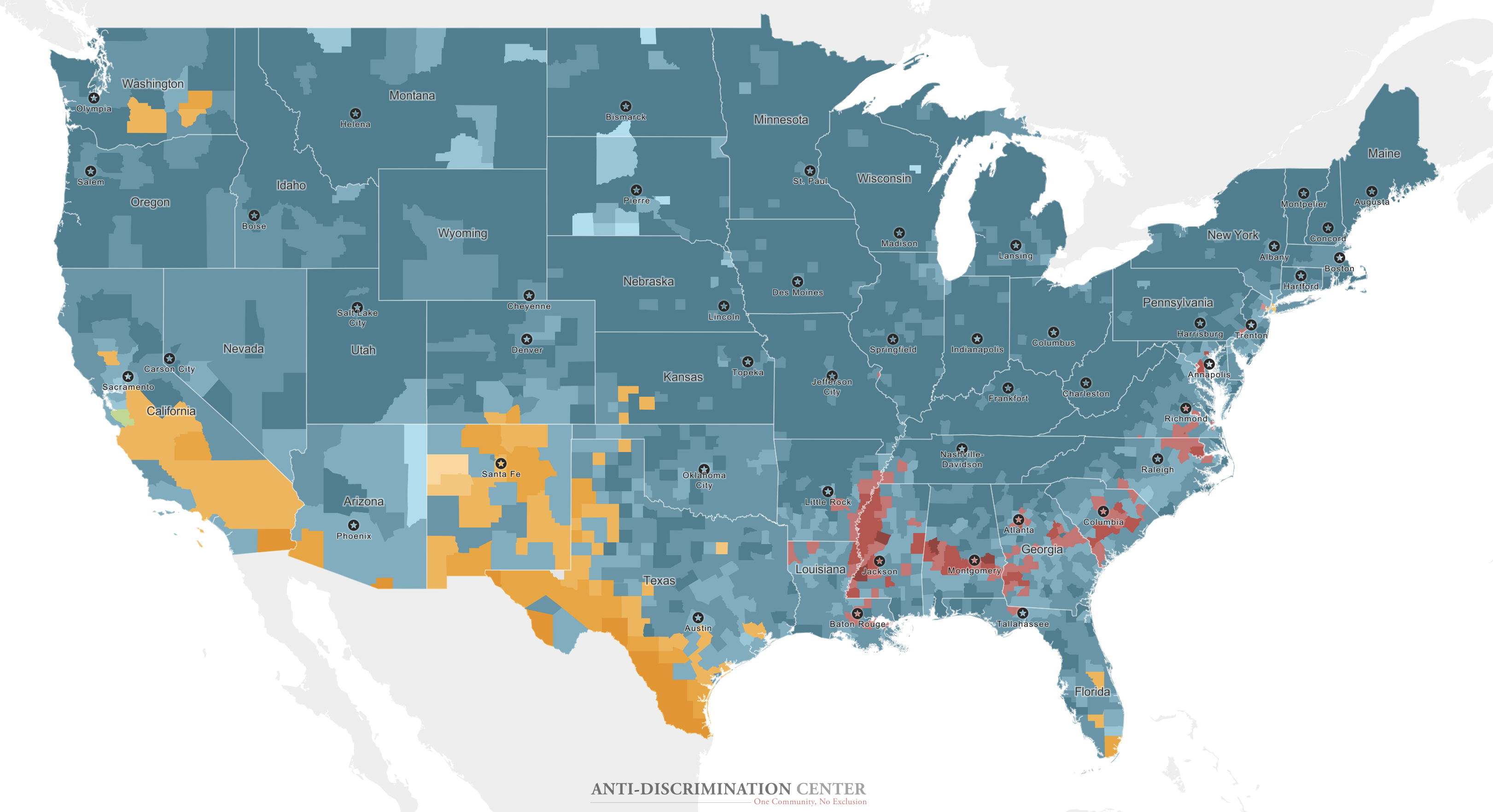
Together and individually, these three interactive maps uncover extreme segregation in ways that most previous mapping has not. Maps of the African American and Latino populations highlight areas of disproportionately low and disproportionately high concentrations of those respective groups, allowing a clear picture to emerge of the longstanding phenomenon of residential segregation.
BEFORE YOU GO TO THE maps
Map & Data Resources
These custom maps are best used on a large format device; we recommend especially using a desktop or laptop (in some cases, these maps do not render properly on tablets).
We recommend not using on a phone: in the full country view, a phone loses too much of the detail. If you do run these maps on a tablet or phone, please make sure you allow a map to load fully before you switch maps or go to a different level of geography (for example, from county to block group).
As explained by Craig Gurian, Anti-Discrimination Center’s executive director, “While it is certainly true that much progress towards integrating different communities has been made since 1968, the sad truth is that, when you’re examining residential segregation in the United States 50 years on, areas of pronounced segregation persist all over the country.”
Likewise, the “WHICH” map, where the color that is coded for the level of geography selected corresponds to the group that makes up the largest percentage of that geography (the groups, using Census Bureau terminology, are non-Hispanic Whites, Blacks, and Asians, and Hispanics of any race). The stronger a group’s domination of a geography, the more vivid and intense the color. As shown in the maps, there are many vivid and intense areas of domination. In some cases (New York City, for example), strong areas of domination by one group often neighbor strong areas of domination by another group.
Gurian said, “It is particularly striking how many areas that hold themselves out as ‘progressive’ on issues of race have high levels of segregation. And, even though some ‘advocates’ and government officials would say that this is an old-fashioned view, we don’t think that domination of an area by any group to the exclusion of any other group is acceptable — there is no ‘good kind’ of residential segregation.”
Compare different years, groups, and geographies with the interactive maps
Users are able to switch between and among the three maps, and between a “Census 2010” view and an “ACS 2016” view, the latter based on data from the 2016 5-year American Community Survey. As noted, maps can be set to show state, county, census tract, or census block group levels. Selections can be changed at any timne.
The African American Map
This map focuses on areas of very low and very high concentrations of the African American population to illustrate patterns of segregation. By providing color-coding of the African American percentage of the population at each level of geography where that percentage is under 1 percent, up to 2 percent, and up to 3 percent at the low end, and above 50 percent on the high end (the rest of the map is shown in gray), the user is able to see just how much of the country has an extremely low percentage of African Americans, and those areas where, in contrast, the African American percentage of the population is disproportionately high.
Instructions for using the maps
- Choose a map by making your selection at the bottom of the screen. You can switch back and forth at any time.
- Switch between 2010 Census data and 2016 5-year American Community Survey data by making a selection at the upper right window above the maps.
- Find a specific location by clicking on the search icon to enter addresses, place names, counties, and postal codes.
- Zoom by using the plus and minus buttons at the upper right of the map. Clicking home brings you back to the initial map view. You can also double-click to zoom in, or, using a trackpad or mobile device, zoom in or out using your fingers. You can also use your mouse, arrow keys, or track pad around the map.
- In the African American and Latino maps, you can click on the color representing a particular percentage range in the legend at the lower right of the map, and only the geographies corresponding to that range will “light up” on the map.
- To get data about a particular geography, either hover over the area with a pointer, or tap with your finger on a mobile device. The data will pop up.
Click on the color representing a particular percentage range in the key at the lower right of the map, to spotlight the geographies corresponding to that range.
Even when looking at the map of the whole country, there are useful insights to be had by changing from the default, county-level of geography. Use the geography dropdown in the top-right portion of the window to switch to block group. States that did not seem to be almost completely filled with areas where African Americans are at the lowest percentage levels (like California, New York, New Jersey, and Pennsylvania, for example) turn out to have many more of those areas when the lens in brought closer in.
Users can navigate to a particular location by using the address or geography search box, the panning feature, and the zoom tool (plus, minus, and home at the top right, or double-clicking on the map itself). These map explorations illustrate the reach of segregation both across the nation and down to the level of specific neighborhoods.
Hoever over or tap any area to get the specific data about that state, county, census tract, or census block group. (Geographies where the Census reports fewer than 100 people are shown in very light gray, instead of being color-coded. See note.)
The Latino or Hispanic Map
The Latino or Hispanic map is organized in exactly the same way as the African American map except that the percentage groupings at the low end are under 3 percent, up to 5 percent, and uo to 7 percent.
Be sure to zoom in and look at different geographies. In New Jersey, for example, the true picture does not begin to come into focus until you are down to the census tract level. In California, there is some important information to be gathered at the county level, but much more when at the census block group level. Thus, for example, it is only when in zoomed in on Cupertino, California, the home of Apple Computers, that one can see how disproportionately low the Latino population is almost all of that city.
What about “voluntary segregation”?
ADC’s Gurian said, “The proposition that any significant amount of segregation exists as a ‘free choice’ is false and outrageously so. Most segregated patterns were created by explicitly and intentionally discriminatory conduct on the part of all players, private and public, in the housing market. Today, segregation continues as a function of different racial and ethnic groups claiming turf as their own. There is little ‘free choice,’ if, by that term, one means the ability of members of all racial and ethnic groups to enter or leave a particular geography in accordance with their own wishes.”
Notes for users
These maps are designed to show extremes of segregation. The color-coding on the African American and Latino maps does not by any means encompass all of what demographers generally consider to be “high” levels of residential segregation.
These maps rely on Census Bureau tabulations of the 2012 to 2016 American Community Survey (ACS) and the 2010 Decennial Census, both available at www.census.gov. The ACS, since it is a sample, is subject to some sampling error.
Census geographies with fewer than 100 people are grayed out intead of color-coded because displaying a range for such areas might be visually misleading. However, if you hover over such an area you can see what data the Census Bureau has available for such geographies.
Segregation perpetuated by government action: New York City denies applicants in affordable housing lotteries an equal playing field
In a case currently pending in federal court in New York, the Anti-Discrimination Center is co-counsel for African American plaintiffs who allege that NYC’s outsider-restriction policy in affordable housing lotteries (giving priority for 50 percent of the units to existing residents of the community district where the housing is being built) causes a disparate impact and perpetuates segregation on the basis of race because most community districts are dramatically less racially and ethnically diverse than the City as a whole.
The complaint also alleges that NYC intentionally discriminates on the basis of race because the outsider-restriction policy is a means by which to pander to those in New York who are resistant to neighborhood racial or ethnic change.
The City’s former deputy mayor for housing and economic development, Alicia Glen, has acknowledged in her deposition that she knew that “New York City is still a city that is deemed to be quite racially segregated”; neverthless, she admitted that, as far as she was aware, the City did not have a plan for ending residential segregation. See ECF 262, at 3. When she took office, “racial patterns was not – or race discrimination issues were not front and center at all with what we were deeming to be the challenges facing the housing market.” See ECF 294, at 24.
At the deposition of a former commissioner of HPD who is now a deputy mayor, the former commissioner, when reminded that she had said publicly that part of the worry about neighborhood change was that people coming into the neighborhood “may look different,” took the remarkable position that the worry about new residents “look[ing] different” could be just as much based on their having “more purple or green hair” as their being of “different races.” See ECF 186, at 5-6.
A deputy commissioner at HPD confirmed in his deposition that, in today’s New York, there are people both in white neighborhoods and in neighborhoods dominated by other racial groups where racial change or the prospect of racial changes makes them feel uncomfortable. The Deputy Commissioner, after noting that he “couldn’t speak for every resident,” admitted that “I think it’s likely and I think people correlate that change [neighborhood racial change] to development, new housing development. So as a result they oppose housing development, especially Affordable Housing Development.” Asked as a follow-up about whether there is anything politically sensitive about broaching the idea of desegregating neighborhoods that are currently segregated by race or ethnicity, he went on to acknowledge there was, and specified a relevant consequence: “I believe so, yes, especially voting against Affordable Housing Projects.” See ECF 370, at 3.
What about the idea that everyone wants to stay in the neighborhood that he or she is living in now? Actually, at least 85 percent of unique applicants from every racial group applies outside of their community district at least three-quarters of the time.
Victims of the outsider-restriction policy may contact the Anti-Discrimination Center to discuss their rights either by calling 212-537-5824, x2 or by going here.