Sept. 11, 2014 — It’s impossible to spend a day in New York City without hearing a dozen times how “diverse” the city is.
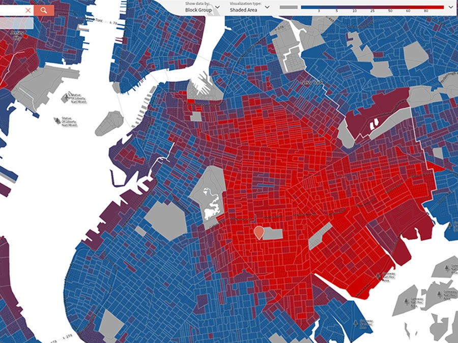
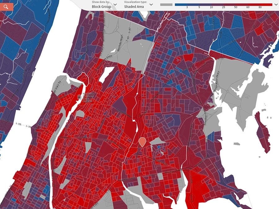
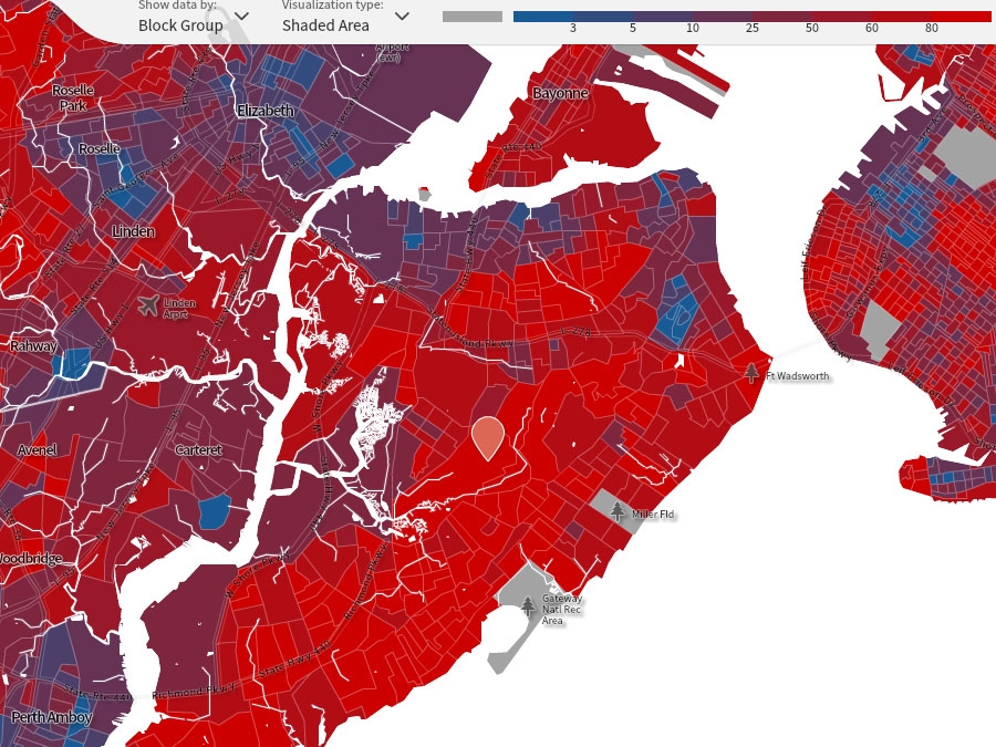
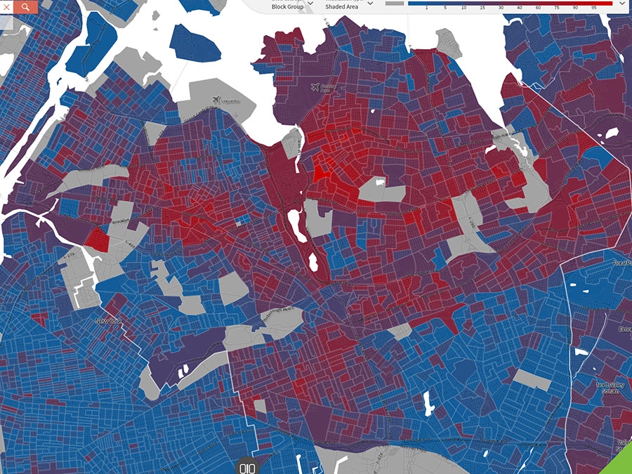
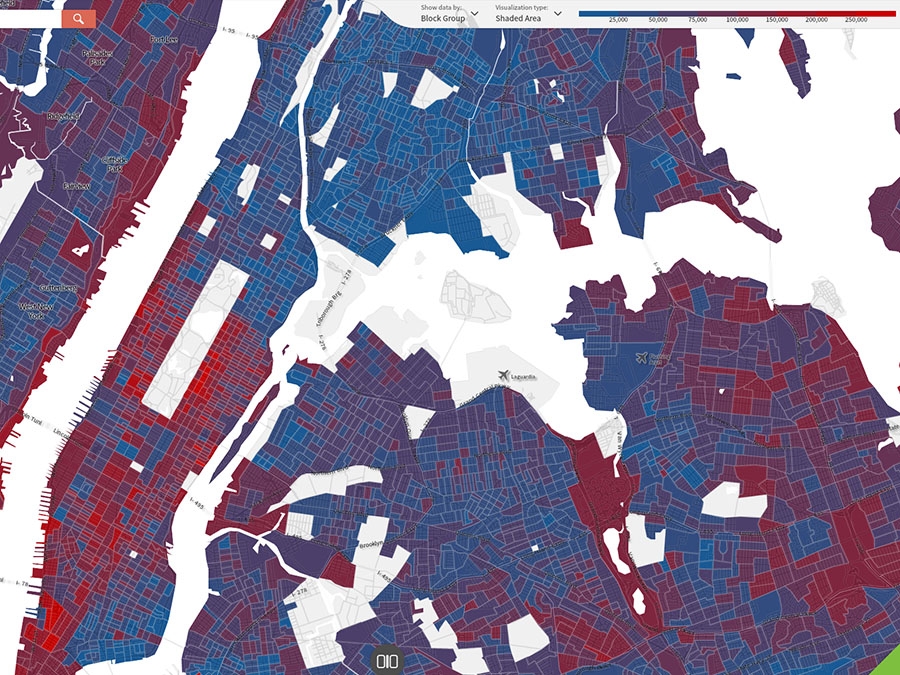
That’s true on an overall level, but strikingly untrue on a block-by-block level. New York City remains one of the most residentially segregated cities in the country.
What tools would you like to see?
We’re ready to develop an extensive collection of demographic and mapping tools. What tools would be useful to you? Tell us
This mapping, based on 5-year American Community Survey Data (2008 - 2012), provides vivid evidence.
In the upper righthand corner of each of the maps, a key shows eight percentage bands for the studied group.
Data is shown on the Census block group level — larger than a Census block, smaller than a Census tract.
Note that the boldest blue means that the racial or ethnic group in question represents only 3.0 or less of the Census block group. Hitting the pause button allows you to advance through the slideshow manually (using the arrows) at your own speed.
Maps generated using the wonderful tools made available to us by our colleagues at Social Explorer.

